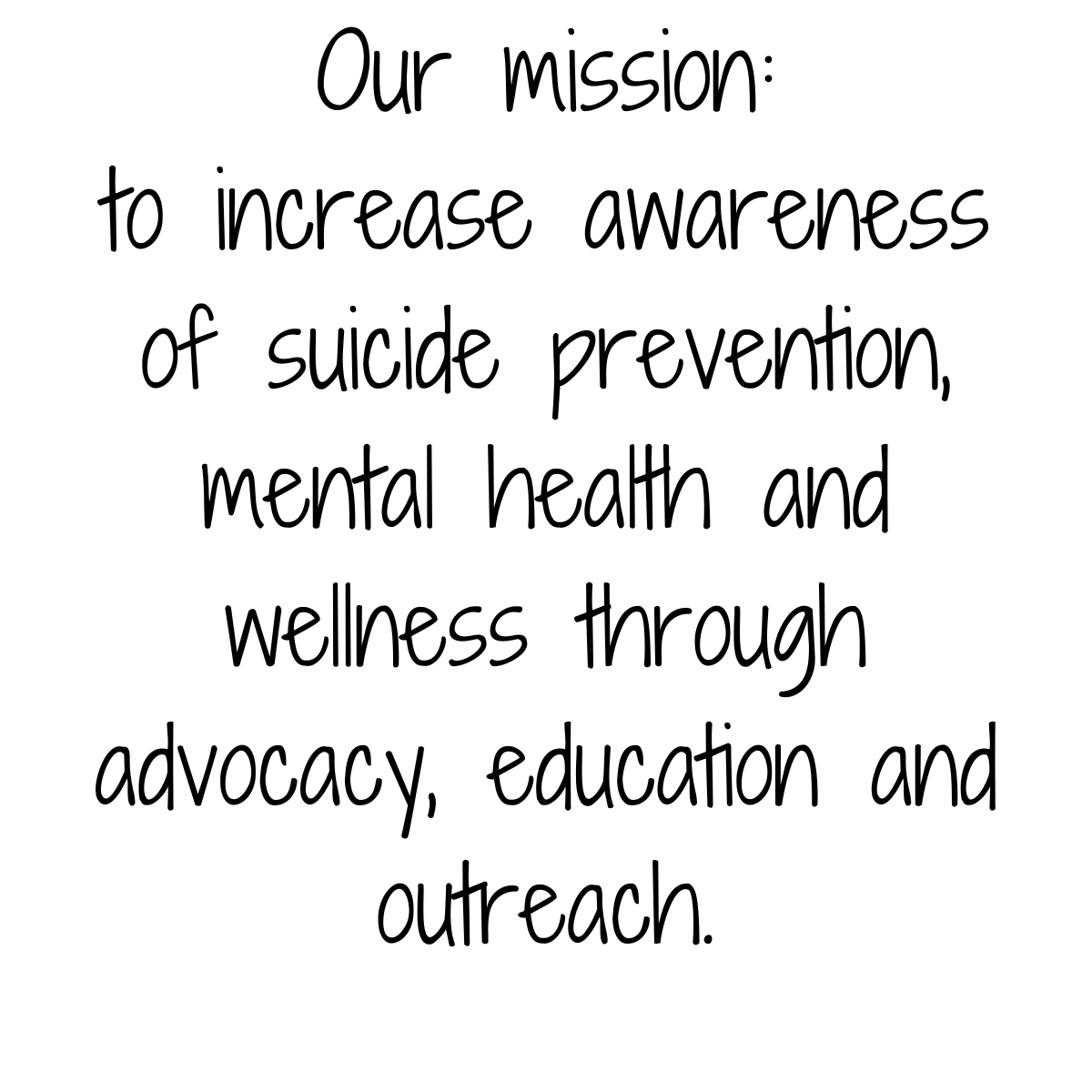
At 2B CONTINUED, we are grateful for the support of businesses, organizations, and individuals who help further our mission of suicide prevention and mental health awareness.
Our branding, including our logo, colors, and messaging, represents our commitment to education, hope, and action. To maintain a consistent and recognizable presence in the community, we ask that all partners, volunteers, event organizers, food vendors, and supporters follow these guidelines when using our logo and branding in promotional materials.
Whether you are hosting a fundraiser, sponsoring an event, or providing services at one of our events, these guidelines will ensure that our brand remains clear, professional, and impactful. Thank you for your dedication to our cause!
Our Name: 2B CONTINUED
The name 2B CONTINUED represents hope, resilience, and the belief that every life is a story still being written. It reflects our mission to continue conversations around mental health, provide lifesaving education, and support those in need. The number “2” and letter “B” serve as a reminder that there is always more to come—that no one’s story should end too soon.
To maintain brand consistency and impact, 2B CONTINUED should ALWAYS be written in all capital letters in all communications, promotional materials, and logos. Variations such as “2B Continued” or “2b continued” should not be used.
Our Logos
2B CONTINUED has two primary logo variations to accommodate different design needs while maintaining brand consistency:
- Round Logo – This circular design features our signature branding elements in a visually cohesive format, ensuring high recognition at any size.
- Horizontal Logo – This version is best suited for banners, flier footers, and marketing materials where a wider layout is more effective. It maintains all key branding elements while providing a streamlined and professional appearance.
Both logos should be used in their original, unaltered forms to maintain brand integrity.
Our Font: Shadows Into Light
Our primary font, Shadows Into Light, is a clean, handwritten-style typeface that conveys warmth, approachability, and authenticity. Its smooth letterforms and natural flow make it ideal for adding a personal, heartfelt touch to our messaging while maintaining readability. This font reflects 2B CONTINUED’s mission of hope and connection, reinforcing our compassionate approach to suicide prevention and mental health awareness.
For consistency, Shadows Into Light should be used for key headlines and emphasis, while a complementary sans-serif font may be used for body text to ensure clarity in longer passages.
Our Colors
The colors used in the 2B CONTINUED logo—teal and purple—are deeply meaningful, as they reflect the colors of the suicide prevention awareness ribbon.
- Teal represents healing, hope, and resilience, symbolizing the importance of mental health awareness and support.
- Purple represents remembrance and advocacy, honoring those affected by suicide while reinforcing the commitment to prevention and education.
Together, these colors create a powerful visual identity that aligns with our mission of saving lives, raising awareness, and continuing the conversation about mental health. These colors should always be used in their correct shades to maintain brand integrity.

You must be logged in to post a comment.